
Challenge
To simplify the customer journey for web visitors, the strategic team at NIBC wanted to consolidate four separate websites into a single, cohesive platform, without losing organic traffic or compromising on user experience. The webdesign had to strictly follow new branding rules, which made the design process more complex. Innovative ideas and technology upgrades were crucial to ensure the bank stays current and can adapt in the future.
Services used
Service Design
Wireframing
UX/UI Design
Analyse
Development
Project Management
Change Management
Solutions
To tackle these challenges, Hyperion leveraged their expertise in service design, wireframing, and web development.

- To get started, our service designers and strategists organised co-creation workshops to understand the new branding and user requirements of this new complex platform. By creating wireframes and prototypes early, our designers ensured a seamless integration of new branding elements while focusing strongly on user experience. They organised regular feedback sessions with the core team at NIBC, ensuring alignment of important stakeholders and allowing for iterative improvements in the design process.
- Developing the website with the Umbraco content management system, we employed an agile approach. As the deadline was quite tight, this process ran simultaneously with the design phase. The developers started out with the basic requirements and iterated rapidly, based on the progress of the designers. This close collaboration and shared language between our design and development team ensured smooth sailing throughout the project. Next to that, the bi-weekly demos of the Umbraco CMS and its functionalities kept all stakeholders informed and engaged during this intense and fast process.

Results
The project successfully merged four websites into one, maintaining traffic and enhancing user experience for all NIBC clients and partners. Hyperion’s strategic planning and agile execution resulted in a timely launch, with positive feedback from the team at NIBC. The new website features advanced digital forms, encrypted data transmission, and functional tools that meet NIBC’s standards.
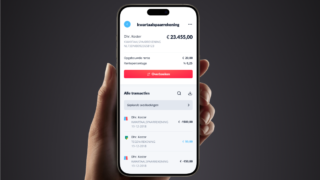
But it doesn’t end there. Hyperion supports other ventures of NIBC, like the mobile savings app, Lot Hypotheken or Woonzorg, with ongoing design and development requests, making this collaboration a partnership on both a strategic as implementation level.

Conclusion
Hyperion’s meticulous approach and dedication to understanding NIBC’s needs are pivotal in delivering a unified and robust digital presence. This project exemplifies our ability to handle complex digital transformations, with innovative solutions and high-quality outcomes, fostering long-term digital growth for NIBC.
Our services

Expert support when you need it most
Your business deserves more than just quick fixes; it needs a partner who understands your goals and challenges. With access to a network of over 500 experts, we’re equipped to provide the right support.

Reliable managed IT services for business growth
Running a business is challenging enough without having to worry about technology. With our tailored managed services, we keep your systems secure, up-to-date, and running smoothly.
Want to take the step together?
Reach out to us, and let’s explore how we can build future-proof solutions together. We’re just a message away!